
Despite working at Android Authority, I've used iPhones, iPads, iMacs, MacBooks, and lots of other Apple products. I've always preferred Android because I feel it fits more with my needs, what with its extremely customizable interface as well as the wealth of options when it comes to hardware design and pricing.
Since Android works better for me, I've never actually relied on an Apple product before. I've always known I could put it down and switch to my trusty Android phone, Windows laptop, or whatever other product I use daily.
However, when the opportunity came up here for a writer to switch to an iPhone for a week to see what it's like, I jumped on it. I figured this would be a way to put my convictions to the test. Is Android really better for me than iOS, or have I just become complacent and comfortable with Android?
With this experiment, I wanted to take away the safety net. I wanted to dive into the Apple ecosystem head-first and see if it's as clunky and bad as I thought it was.
Here are the rules I placed on myself:
- I used an iPhone 8 Plus (Rose Gold, if it matters) on the latest version of iOS (11.4.1) from Sunday morning to the following Sunday morning — a full seven days.
- During that time, I could not even touch my Android daily driver: a OnePlus 5. I had to touch some other Android phones here and there because I work for Android Authority, so it'd be hard not to.
- Anything I could do on the iPhone I did on the iPhone. That means texting, messaging, phone calls, music, internet searches, and more.
- I relied on Apple apps as much as possible and only used the default settings and setup whenever I could.
Over the course of the week, I installed third-party apps like Facebook, Starbucks, Amazon, Slack, and so on. I tried my best to use every basic feature of the phone at least once, including things like Apple Pay, the Apple App Store, Apple Maps, and Apple News.
Be forewarned: both Apple and Android criticism is coming your way.
At this point, it really has become a matter of taste

Before I get too deep into things, I want to start out with discussing how close iOS and Android are nowadays. When the iPhone first launched, Android and iOS were miles apart. The first version of iOS didn't give a user the ability to copy or paste text, and the first version of Android had no video recording functions.
Now though, there wasn't much I couldn't do with the iPhone that I'm used to doing with Android. I got my Wi-Fi hotspot up and running on the iPhone in no time when I was outside in a park working on a story. I set up and used Apple Pay and found it just as easy as Google Pay on my OnePlus 5.
Going through the beginning setup process on the iPhone was a breeze, with the wizard asking me the same questions (and asking me to check the same boxes) as the countless times I've set up an Android phone. It was easy to customize my phone by changing notification sounds, altering the wallpaper on the home screen, or syncing my contacts with the cloud.
Apple's old adage — "It just works" — was true with most things I did with my iPhone. Things just worked.
We all like it when our phones work correctly, but that's not what makes us feel like our phones are life necessities.
However, what makes someone love a product (as people clearly love their iPhones) is more than just getting things to work. Your phone needs to feel like an extension of yourself in some way, and you need an emotional connection to it. If you think that's preposterous, ask any Android fanboy or iPhone diehard to switch from one to the other — their facial expressions will prove the deep emotional connection to the device and the software.
With that in mind, the things that "just worked" during my iPhone experience didn't leave much of a lasting impression on me. Instead, what worked surprisingly well — and what didn't, or made no sense to me — stayed with me for the entire week.
Let's talk about the good things first.
3 things I loved about the iPhone

Apple App Store
Having used the Google Play Store for nearly ten years, I've grown used to its design and idiosyncrasies. The format and functional layout of the Apple App Store is much better than the Play Store.
Here's what a search for "Snapchat" looks like on each platform:

With the Apple App store on the left, the app I want is right there at the top. There's a story underneath it pertaining to Snapchat in some way, but what I'm looking for is front and center. There's nothing else to see without me going out of my way to scroll down.
Google should take some cues from the Apple App Store and cut out some of the clutter.
Conversely, the Google Play Store shows the app I want at the top, and then a whole bunch of icons that I don't even know. What does Spotify have to do with Snapchat? Furthermore, what the hell do ASCII Faces have to do with Snapchat? Why am I seeing these things?
I get that Google makes money by getting me to download more apps and try more things from the Play Store. Apple does, too, and it still doesn't feel the need to shove a bunch of useless stuff in my face when I'm trying to install an app.

Bluetooth
Without any hyperbole, using Bluetooth on an Android device has often made me want to throw the device across the room. I've had to stop myself from doing so several times over the years. Using an iPhone for a week only cemented my feelings on the matter.
I connected three things to the iPhone via Bluetooth: my Garmin vivosport fitness tracker; my girlfriend's car stereo; and my Bluetooth headphones. In every instance, my devices connected the first time I tried and worked exactly as I expected for the entire week.
It was like being in heaven.
For the life of me, I have no idea why Android can't get this down. It can't be the hardware, because I've had Bluetooth problems on every single Android device I've ever owned from half-a-dozen OEMs. What does Apple know that Google doesn't?
Of all the things I did with the iPhone over the week, this is what I will miss the most.

Camera
I'll be honest: I'm not a big photography guy. Even on Android Authority, some of the nitpicking that's done with camera apps, lenses, and sensors just leaves my head swimming. My chief concerns are whether the camera takes good pictures, whether the app launches when I want, and whether I can get to the modes and settings fast enough not to miss out on a photogenic moment.
The iPhone's camera does all these things.
The camera on my OnePlus 5 is good, but the iPhone edges it out by just being easier. The little scroll wheel that lets me quickly get to the different modes is brilliant.The camera app opens fast. The shots I take look good even though I have no idea what I'm doing.
I didn't take too many pics with the iPhone, but what I took were great. Now that I'm back to Android, I'm finding myself missing the iPhone camera a little bit.
3 things I disliked about using the iPhone

Audio
I hate using the word "audiophile," but that's the only term I can come up with to easily explain my inclinations when it comes to sound. I'm a musician and a music lover; I also love movies, and nothing makes a film experience better than high-quality sound.
With that in mind, the iPhone left me ho-hum on the audio front.
First off, the iPhone just isn't loud enough. When I'm listening to Slayer, I want to feel "the meaning of pain" while my ears rattle. When I'm writing and listening to classical piano to keep focused, I want the rest of the world to drown out so all I can hear is the quiet plinking of keys.
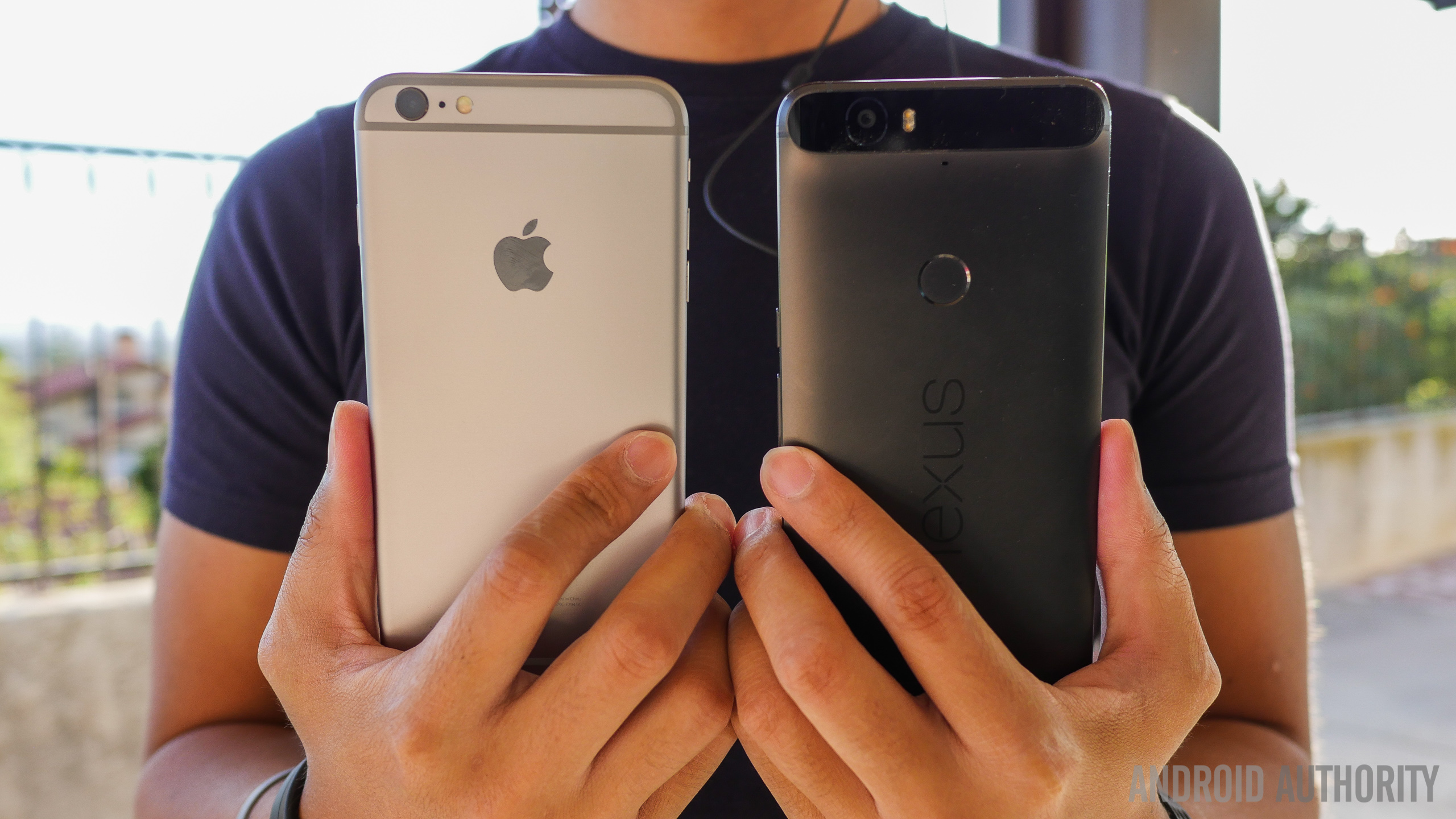
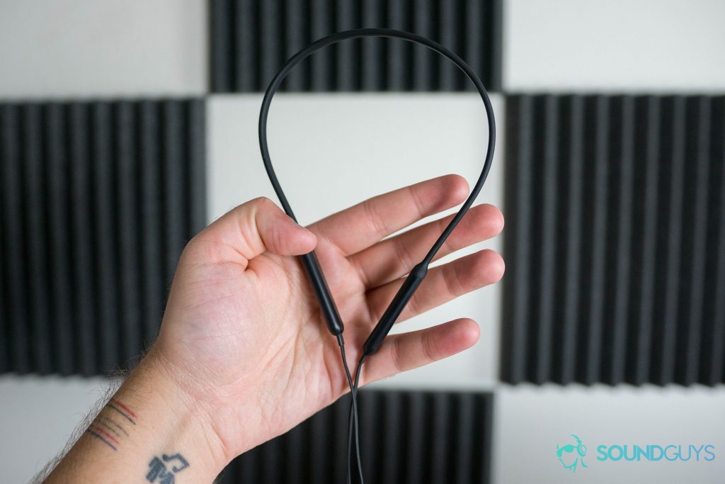
No matter what I tried, the iPhone just didn't get me there. It's not my headphones — they are the same cans I use when connected to my OnePlus 5 (and my Nexus 6P before that).
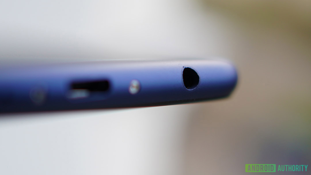
News Flash: The iPhone 8 Plus doesn't have a headphone jack.
I thought maybe wiring in would make a difference, but there was no headphone jack on the iPhone 8, so I couldn't test that theory without buying a dongle I'll never use again. I know the headphone jack has been talked about to death at this point, but it really is ridiculous Apple forces you to abandon it when you buy an iPhone. The Android ecosystem is filled with devices that also abandoned the jack, but at least I can choose not to buy those devices and still use Android — not so much with the iPhone. It's asinine.
Anyway, even if I ignored how quiet the iPhone is, the sound itself was flat and uninspiring. Lows didn't feel that low and highs sounded like they were way off in the distance. It got to the point where I was looking forward to connecting my headphones to the iPhone because of how easy it is (see the previous section) and then walking away disappointed by how mediocre it sounded.

Keyboard
The iPhone comes with a standard keyboard, and during my time with the device, I used it exclusively. Apple generously bestowed iPhone users the ability to swap out the standard keyboard for other third-party versions (including Google's own Gboard) with iOS 8 in 2014, but I didn't use any of those options. Apple wants me to use its keyboard, so that's what I used.
It was, in a word, awful. It was also quite illuminating.
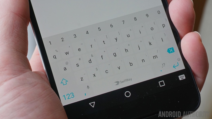
The horrible layout of the keyboard makes you need to do not one, not two, but three taps to insert a comma in a sentence. First, you tap the keyboard-swap button, then you type a comma, then you hit the button to go back to the main keyboard.
Three strokes to use probably the second-most-used punctuation mark in the English language.
In true Apple fashion, the company says, 'This is the keyboard you want, just accept it.'
Even if you don't care about proper punctuation or you can ignore how counterproductive it is to hide anything that's not a letter, the keyboard still has no features. There's no swiping function and there's no way to customize key size or spacing. There's also no haptic feedback control. Nothing.
I don't know how iPhone users went until 2014 without access to another keyboard. A week with these keys would have been enough to make me switch to Android.
Settings
As I explored the iPhone I got to know the various Apple apps, some of which have been there since the first iPhone launched in 2007. Many of them worked just fine for my needs, but some I could tell would take some tweaking.
While in the Email app, I realized I wanted to change the signature from the default "Sent from my iPhone" to something less embarrassing (lol, jk). I thought of doing this while I was in the Email app in the middle of composing a message.
With Android, I would hit a menu button of some kind to get to a settings or preferences section in the app. Once there, I could change the email signature lickity split and jump right back to my email draft.
With the iPhone, you must move out of any given app and go to the bloated and incredibly complicated Settings hub, which controls almost every individual app and feature.
This may seem nitpicky to you, but it really makes no sense. Why should I leave an app to change its settings? It's the most fundamentally simple concept I can think of with a smartphone (or any computer system!) and Apple is doing it backward.
The settings for an app should all be in the app, not somewhere else. I can't believe I have to even point this out.
I found myself using some apps and thinking of a setting I wanted to change, and then not doing it because I knew I'd have to navigate away to make the change. I'd say "I'll do that later," and then, of course, forget to ever do it.
Even when I went to make a change, I found out the hard way some app settings are in the app after all! Some are over here, some are over there — it's madness! After a day or two of this, I just stopped tweaking things and suffered through the week.
Why I'll never switch

The most fundamental aspect of a smartphone is your connection to other people, organizations, or information via applications. Installing an application creates that connection and the way we keep connected with those applications is through notifications.
After a week with the iPhone, I have the confidence to say that I would never, ever switch to iOS if only because notifications are a chaotic mess.
As every Android user knows, the status bar at the top of all Android devices is your one-stop-shop for all your notification needs. A quick glance will let you know if you have any emails, texts, or reminders. If you want more information, just pull down the drawer and everything you need is listed out in an organized fashion.
If you aren't interested in notifications from a particular app, you just swipe that notification away. The rest will stay behind for you to examine.
It seems so simple, but for whatever reason Apple thinks making notifications pure chaos is somehow better.
First off, not every app creates a notification. For example, here's a GIF of me receiving an email. If you watch the Email icon in the upper left of the screen, you'll see the notification comes through as a red bubble, but it's not in the notifications pulldown:
Why aren't my emails showing up there? I rely on email all day every day, and I need to see those notifications ASAP!
Now, iPhone users are probably going to chime in here and say, "Well, you can turn on mail banner notifications in the Settings app." That's all fine and dandy, but I'm using a freshly-installed version of iOS here with no changes. Apple's default email experience includes no email notifications other than the red dot on the Mail app icon. That's just nuts.
Also, to change that setting I'd have to find it in the Settings app, which is its own beast (see the previous section).
Here's another example. The GIF below shows some likes I got from my farewell post to the iPhone on Instagram. People like me!
Why do I need to see Every. Single. Instagram. Notification? Android would just organize all those likes into one Instagram "hub" notification I could tap or swipe away as I see fit. Now I need to individually swipe away all the Instagram notifications to keep my drawer clean.
This is going to take a while. I also just could hit the "Clear All" button at the top there. Let's do that:
Wait a minute! There was a Starbucks notification in there! Now it's gone forever. Boy, that's inconvenient. Wish I could just quickly get rid of the Instagram notifications, rather than everything all at once.
As with the keyboard nightmare on the iPhone, I now realize why all my friends with iPhones are always missing notifications. If I was stuck with an iPhone, I'd be missing texts, emails, and who knows what else all the time.
Even if I ignored every other criticism I could throw at the iPhone, iOS, or Apple in general, I can't ignore this. I could never use any mobile operating system with a notification system this poor.
A bad notifications system could result in devastating problems with my career and social life. It's not worth it.
Word on the street is that Apple's upcoming iOS 12 update is going to fix at least some of these problems by grouping notifications together, just like Android (*cough*). There will also likely be new shortcuts that will quickly allow you to customize your notifications right from the notifications shade.
However, since I spent the week on the now-current iOS 11, I didn't have access to those new features.
Besides, from what I've learned about the upcoming iOS 12, Apple will likely fix some issues and simultaneously create new ones. Apple will allow developers to put notifications in the dropdown shade, but not on the lock screen. So you'll have duplicate notifications on the lock screen and in the shade sometimes, but some will be buried in the notifications shade to be lost if you don't go looking for them.
We won't know for certain what's happening until iOS 12 lands in September, but from what we know so far, Android notifications will still win the day by a landslide.
Android forever

There are a lot of other criticisms of the iPhone in my notes which I haven't mentioned. Using iMessage is really nice, but since I don't own a Mac computer, its best best feature — texting from a desktop — is unavailable to me. Apple Maps doesn't offer biking directions (why not?!). There's no way to preemptively silence a scheduled alarm before it goes off. You must physically push down the Home button to unlock the phone. I could go on.
I understand I'm an Android guy. I've been using Android for nearly ten years and I'm thus buried in Google's ecosystem. A guy like me standing on a soapbox preaching about how the iPhone is inferior to Android is pointless and annoying.
However, there are millions of people out there who might be thinking about switching from Android to the iPhone (or vice versa). I can only hope those people find this article helpful when making that choice.
NEXT: How to switch from iPhone to Android
from Android Authority https://ift.tt/2Q2LqXA
via IFTTT


Aucun commentaire:
Enregistrer un commentaire